In a fast-paced, tech-driven world with its foot glued to the gas pedal, it’s no accident that a lot of organizations are bucking the trend by shifting their marketing into reverse. That is, they’re intentionally connecting their brands with perceptions of an earlier time, back when things were (presumably) less complicated. Nowhere is this more readily apparent than in the field of design, where a brand’s visual assets can be made to appear as though they’re straight out of a glorious bygone era.
Call it retro, vintage, nostalgic, or throwback. This design technique is increasingly popular for a very good reason. Most people seem to have fond memories of the past. Whether it’s based on specific experience or just a gut feeling, we often associate earlier time periods with somehow being “better” than our current state of affairs. After all, “those were the good ‘ol days.” And “they don’t make ‘em like they used to.” Back then, times were simpler, people were honest, companies did things the “right way,” and a firm handshake was all the assurance we needed. It may be only partially true, but the sentiment is there nonetheless.
Savvy marketers understand this little bit of psychology and, if what they’re selling is a good fit for the technique, they can take advantage of retro sensibilities to make an impact with consumers, whether it’s through web design, packaging, advertising, or other marketing techniques.
The food and beverage industry is full of great examples. As the average grocery shopper has become increasingly concerned about what’s in their food and where it comes from, food companies are legitimately making their products more natural and wholesome. But it’s often the packaging design that seals the deal with the shopper. Muted tones, matte finishes and nostalgic imagery suggest that what’s inside is either fresh off the farm or straight from grandma’s pantry.
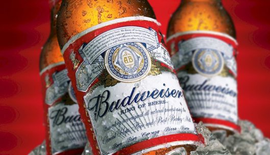
In a time when it’s losing market share to upstart craft breweries, Budweiser wants us to remember its longstanding heritage, which is why this label looks much the same as it did 60 years ago.
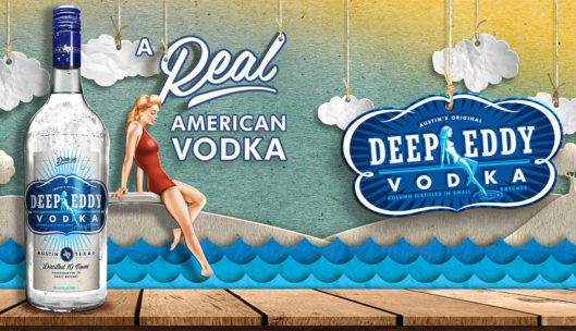
In similar fashion, this vodka brand wants to evoke a wistful longing for those carefree summer days by the lake.
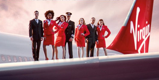
This Virgin Airlines ad evokes an era when air travel was cool, classy, and comfortable. (Did that ever really exist?)
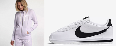
If you are styling yourself to head out to the gym or you are following the current “athleisure” trend of relaxed everyday looks, odds are you will find yourself browsing through fitness gear that may be similar to those worn in retro work out videos from back in the day. Many athletic-wear companies, like Nike, are customizing their traditional apparel choices to mimic work out outfits from the past. Whether it is a fashionable windbreaker or brightly colored leggings – these styles might have someone questioning if you just stepped out of the gym or your closet from the 80s.
The concept of retro design is everywhere, and it’s yet another example of how design is so much more than pretty pictures – it’s a strategic exercise to connect with an audience on an emotional level. And when used judiciously, it can make a powerful contribution to the brand’s success.
